+18%
Contact rate uplift post-redesign
−22%
Bounce rate reduction on product page
50+
Categories supported by the new layout system
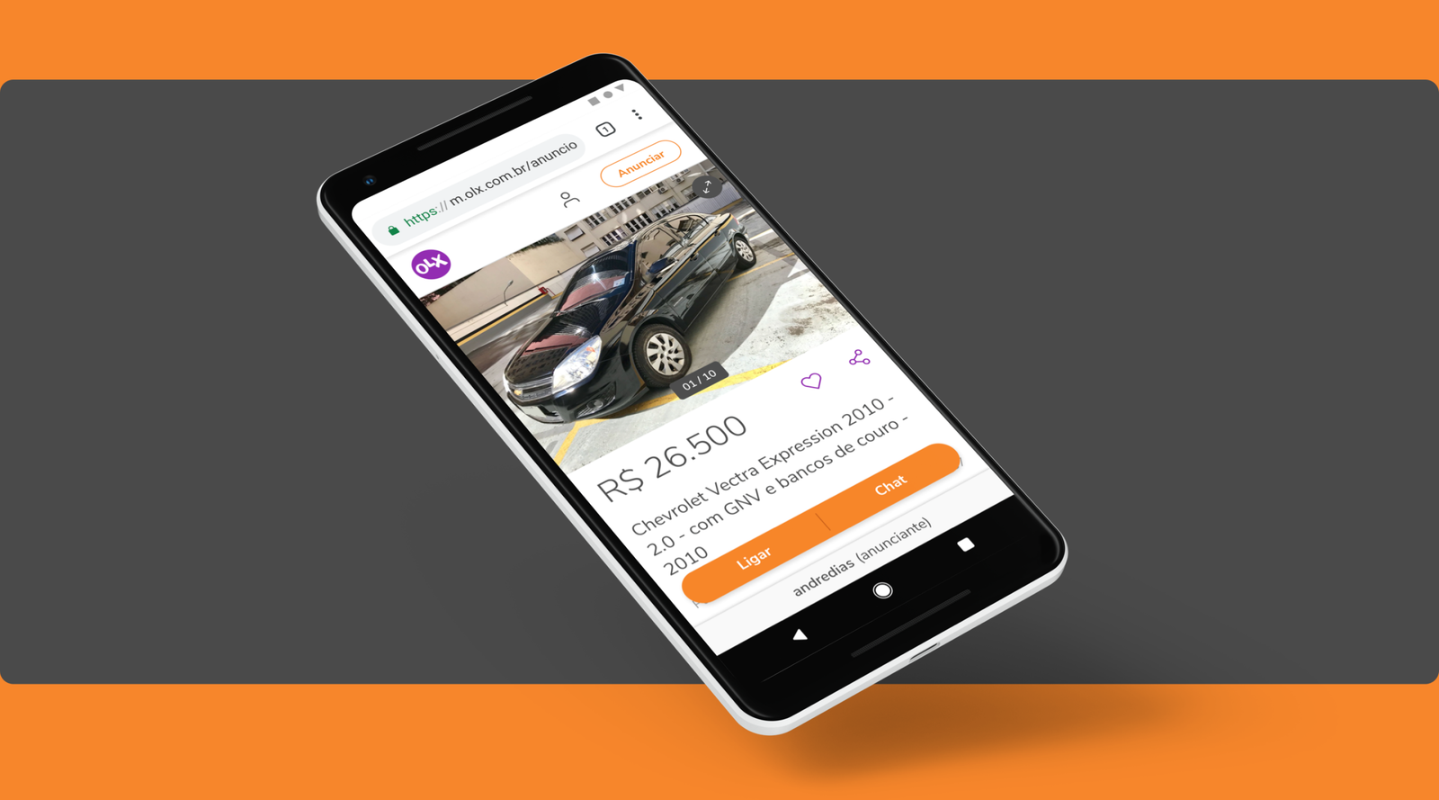
I lead the research and design of OLX Brazil's product detail page — the most visited page in the platform and the one most responsible for whether a buyer contacts a seller or leaves. I own the end-to-end process: user research, competitive analysis, information architecture, interaction design, and engineering handoff.
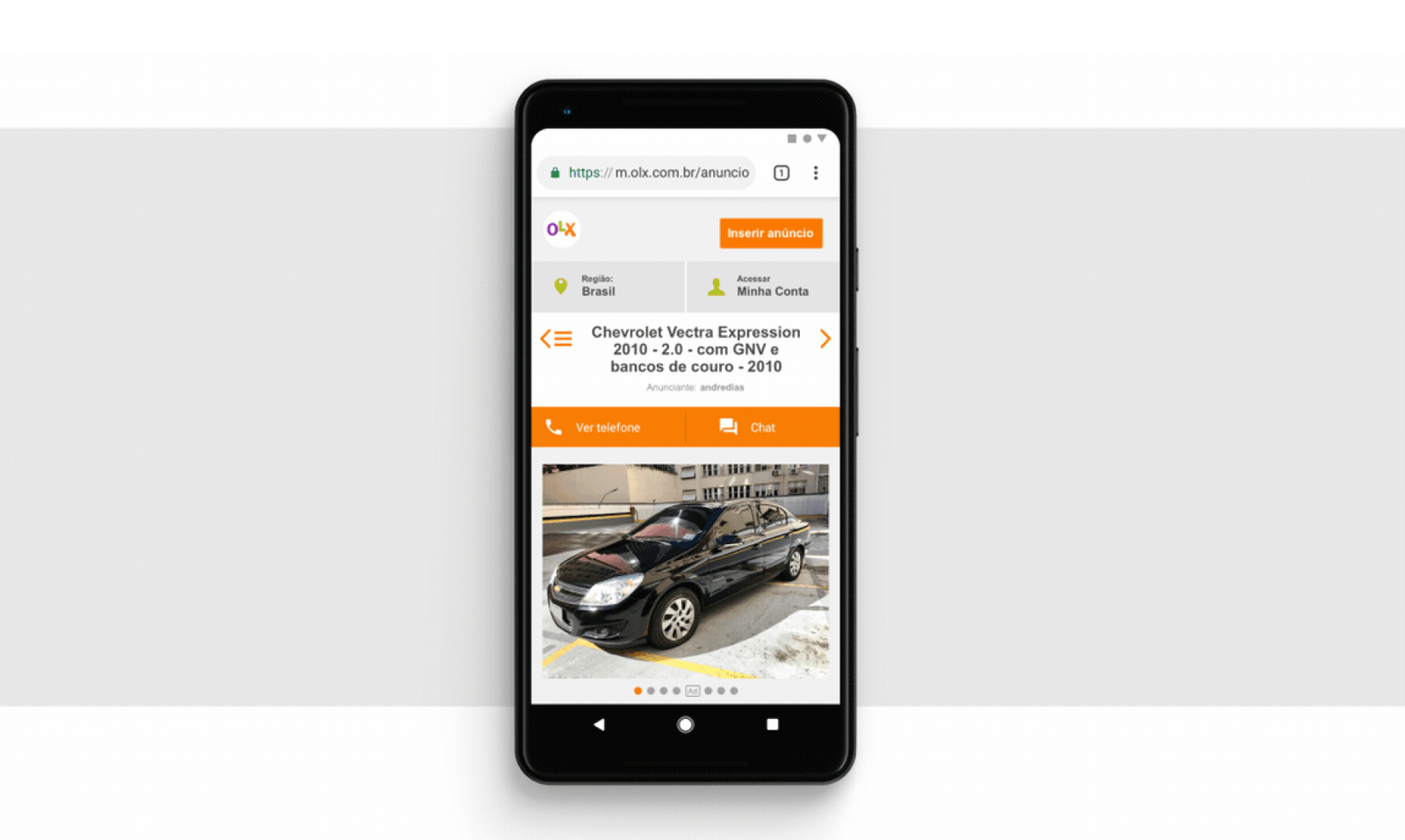
OLX Brazil runs tens of millions of listings across 50+ categories. The existing product page is a static template built for the average listing — which means it works adequately for no listing in particular. Key information is buried, trust signals are invisible at the decision moment, and there's no way to navigate a complex listing without losing your place. The result: high bounce rates on the page that should be converting browsing intent into a contact.
One template trying to serve fifty different realities
OLX Brazil runs tens of millions of listings across 50+ categories. The existing product page is a static template built for the average listing — which means it works adequately for no listing in particular. Key information is buried, trust signals are invisible at the decision moment, and there's no way to navigate a complex listing without losing your place. The result: high bounce rates on the page that should be converting browsing intent into a contact.
Research into the decision moment — and what breaks it
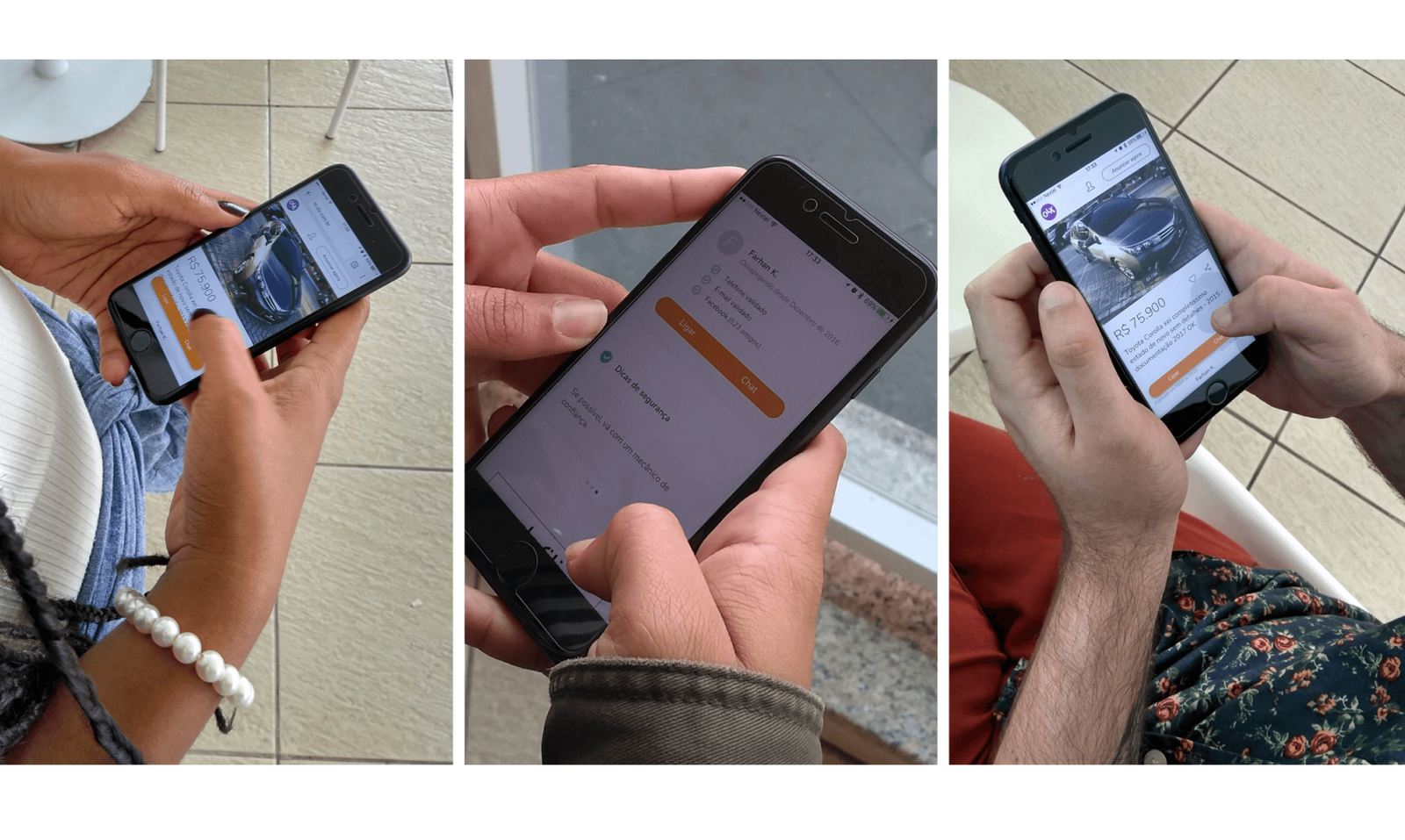
Research begins with a full heuristic evaluation of the existing product page against Nielsen's 10 usability principles — surfacing structural issues before any user data is collected. A competitive analysis covers leading classifieds and marketplace platforms globally to benchmark how product pages handle category diversity and trust. User interviews then focus specifically on the decision moment: what information buyers need to feel confident enough to contact a seller, and what makes them leave without acting.
A car and a blender need different information
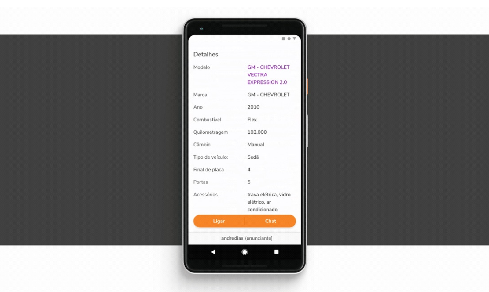
Category-specific fields are buried or absent, forcing buyers to contact sellers just to get basic facts they should already have — a friction point that kills conversions before they start.
Trust signals are invisible at the decision moment
Seller reputation, response rate, and listing age — the three factors buyers cite most often — are placed below the fold, where most users never reach them.
High-information listings have a navigation problem
For cars and real estate, users don't need less content — they need a way to move through it. Scrolling a 40-photo listing with no anchoring creates orientation loss.
The CTA disappears when buyers are ready
Placed statically at the top, the contact action is gone by the time a buyer scrolls through the listing and makes a decision — the exact moment it's most needed.
Category-specific attributes drive higher contact rates
Competitors surfacing category-specific attributes above the fold show higher contact rates than those using generic templates — validating the case for a flexible, category-aware layout system.
01 — Category-aware layout system.
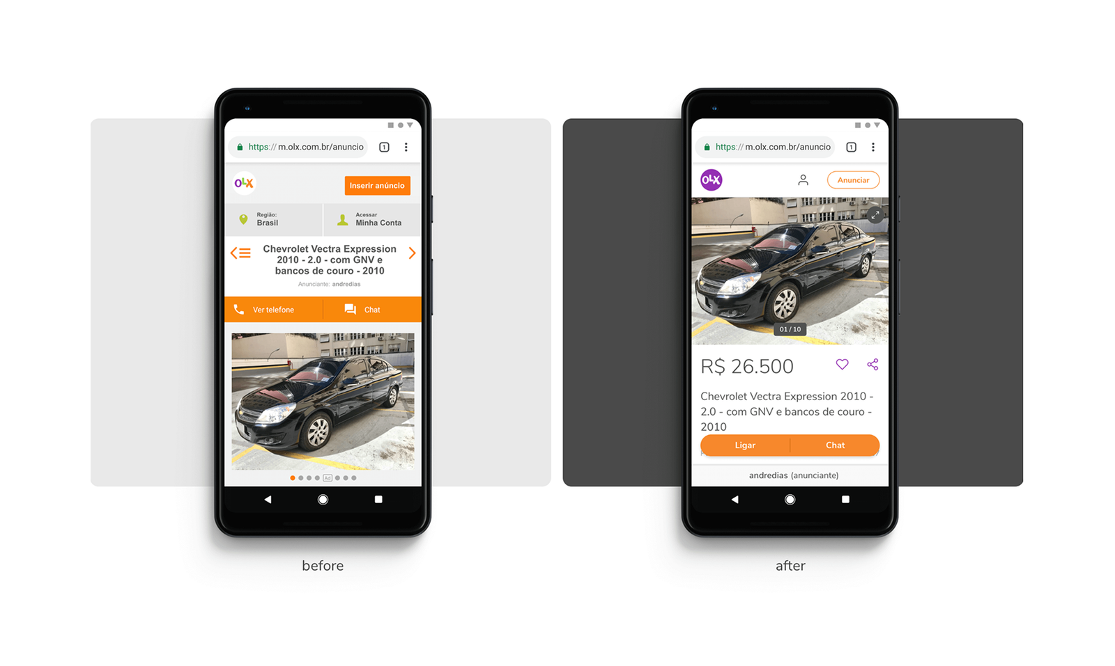
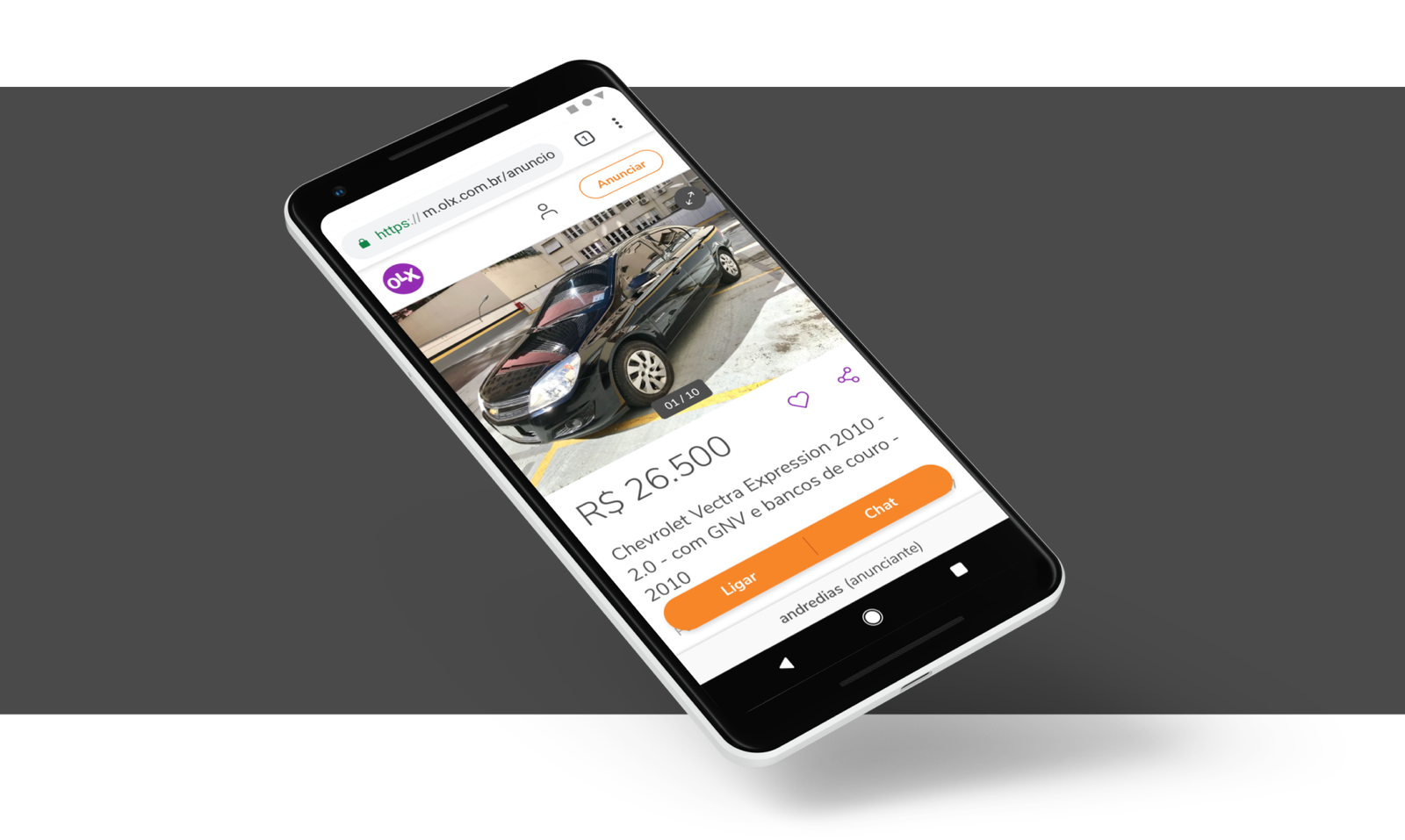
A modular component architecture that assembles differently per category — cars surface mileage and fuel type upfront, real estate leads with location and size, electronics show condition and warranty. Each configuration is driven by what interview participants said they needed to feel confident in that category.
02 — Trust signals above the fold.
Seller reputation, response rate, and listing age moved into the decision zone. Directly informed by what buyers cited as their top three contact-intent drivers — and where they'd disappeared to on the old page.
03 — Anchored in-page navigation for complex listings.
Jump links between photos, specs, seller info, and similar listings — solving the orientation loss finding for high-information categories like cars and real estate.
04 — Persistent, context-aware CTA.
Follows the user as they scroll, adapts its label by listing type. Addresses the research finding that the action disappeared at the exact moment buyers were ready to use it.
Map the full evaluation arc, not just the page.
I'd invest more time mapping the buyer's full evaluation journey — not just the product page itself, but the moment before (search results) and after (messaging the seller). Some decisions optimise for page-level metrics without fully considering what happens at handoff. A jobs-to-be-done framework applied to the complete arc would have sharpened priority order significantly — and might have surfaced the seller-side of the experience as a bigger lever than we treated it.
"A used car and a second-hand blender are both products on OLX — but a buyer needs completely different information to feel confident about each. The same page template can't serve both equally."